 Videos
 Photos


“Branding Gyumri” – Not All Happy with Deem Communications' Product
Although "place branding" is said to be not about logos, slogans, and advertising, these are among the topics now debated after Deem Communications, a public relations and marketing agency, presented its branding concept for Armenia's second largest town on December 9.
The company says they’re doing the branding as part of their corporate social responsibility projects designed to promote the city and community development. They have partnered with the Gyumri Municipality, the Kumayri Historical Center Development Program, the State Tourism Committee, and Gyumri NGOs.
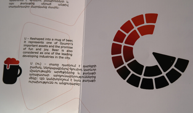
Deem Communications says the logo it has designed is based on the six directions of the brand: Architecture, Champions, Beer, IT, Art & Crafts, Spirit (dialect, humor and people).
The G shape of the circular rotating image, representing G for Gyumri, and its resemblance to one of the buildings in the city, the Black Fortress (built by Russians when they controlled this part of Armenia, and purchased by Gyumri Mayor Balasanyan’s family in 2012), are not acceptable to many Gyumri residents.
The same goes with the choice of beer as one of the branding’s directions. Many are critical of the choice since the main beer factory in Gyumri belongs to the same family, and is one of the main destinations that the city’s mayor takes his guests.
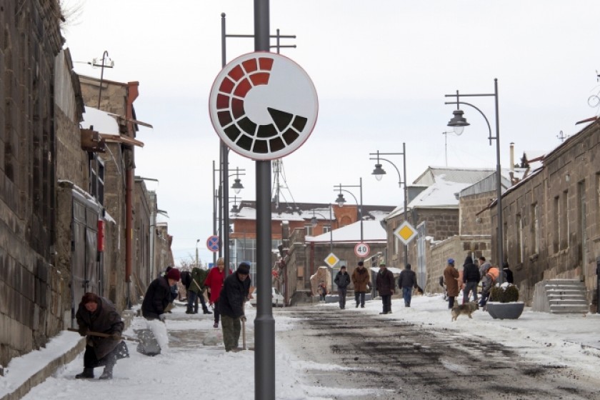
Gyumri photographer Gevorg Ghazaryan, wanting to gauge people’s reaction to the logo, placed it in one of the city’s main streets using Photoshop and posted the picture on his Facebook page.
He says that many people confused it with a road sign. Many just didn’t get the idea. He believes the symbol should have been chosen more wisely, reflecting something that doesn’t need a long explanation written in a booklet.
Creative Director of Deem Communications, Canadian-Armenian Raffi Niziblian, says that they based their branding on heritage, economics, business environment and other research. He told Hetq that more than 2,000 people, from Armenia and abroad, participated in online and offline queries, discussions and seminars. A special working group has been composed, involving experts and representatives of different spheres.

Gor Torosyan from Gyumri, who is in tourism sphere now, says he realizes the importance of making Gyumri known to tourists, but doesn’t agree with the proposed branding.
He says the Latin letter "G" doesn’t mean anything to him. Calling Gyumri a brand by itself, he believes Gyumri residents comprise the city’s natural branding.
“Furthermore, we have so many buildings of architectural value in this city, that the logic of choosing the Black Fortress is unclear. As for the letter G, it could just as easily stand for Goris, Gavar, or some other place. A phaeton carriage would represent our culture better.”
Niziblian says the branding is their gift to the city, which can be accepted or not.
“We do not impose anything, nor do we insist that this is the final version of city branding. Branding does not mean creating anything new, it's packaging of what's already there. During my meetings with the mayor, I suggested creating a Gyumri brand because I always thought we would be able to keep the city in the center of attention to make it more recognizable. As for the selection of the Black Fortress, it was selected as a result of polls. We asked more than 2,000 people and most mentioned that building as the one symbolizing Gyumri. As for the beer, the respondents mentioned it as a developing industrial branch rather than Mr. Balasanyan's business. In any case, we do not impose," concludes Niziblian.
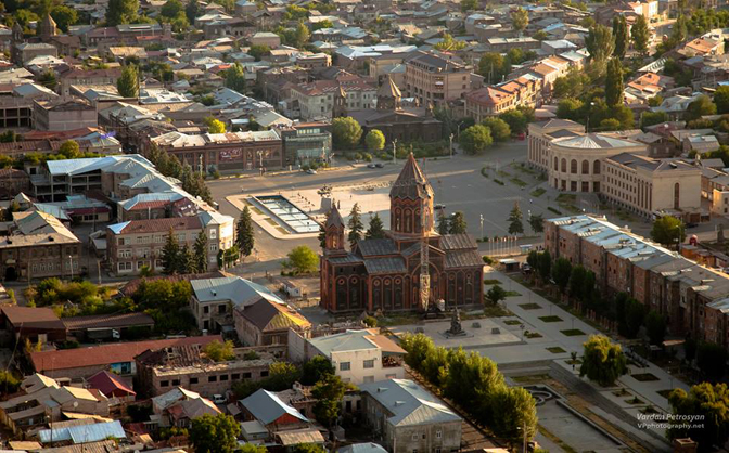
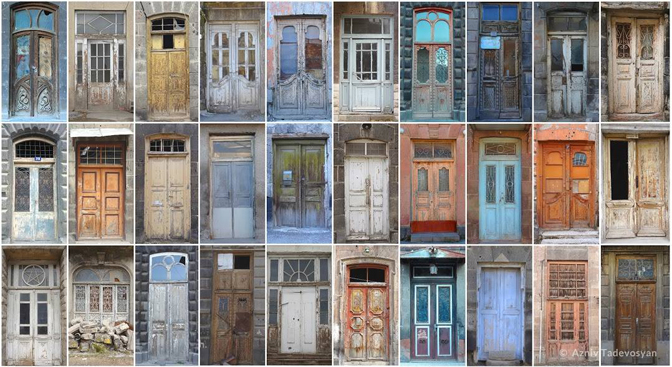
Photos: Yeranuhi Soghoyan, Gevorg Ghazaryan, Vardan Petrosyan and Azniv Tadevossian
Comments (7)
Write a comment